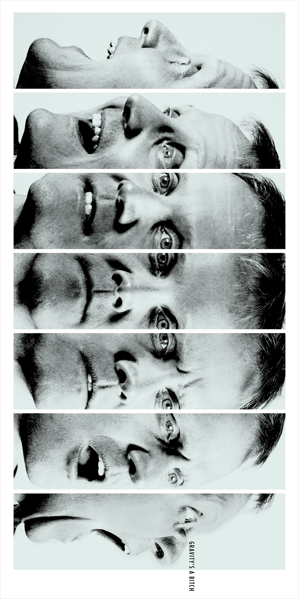
Sure, you could show an image having to do with height—a building, a cliff, an airplane–and then show the view. Or, have the letters of the phrase tumble down the page. But that felt expected. Things inherently having nothing to do with gravity felt like a more interesting challenge. Using sequence to show the expression on a face (d)evolve as it turns to look down the page suggests the results of falling in a less straightforward, and hopefully more cleverly memorable, way. A grittier photographic style complements the dire situation.