Still searching for The One. Title, that is.
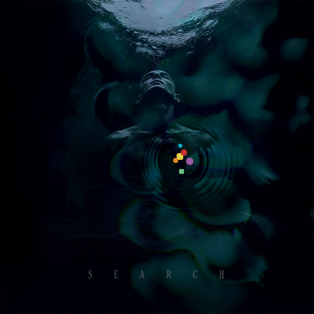
Search
Searching is indeed what this book is all about. For inspiration, for learnings, for growth, for peace. It’s murky. It’s uncertain. It’s uncomfortable. Sometimes outright anxietous. But complacency is a silent killer that sneaks up on you, robbing you of what could have been. And just what are those colorful shapes all about? Exactly.
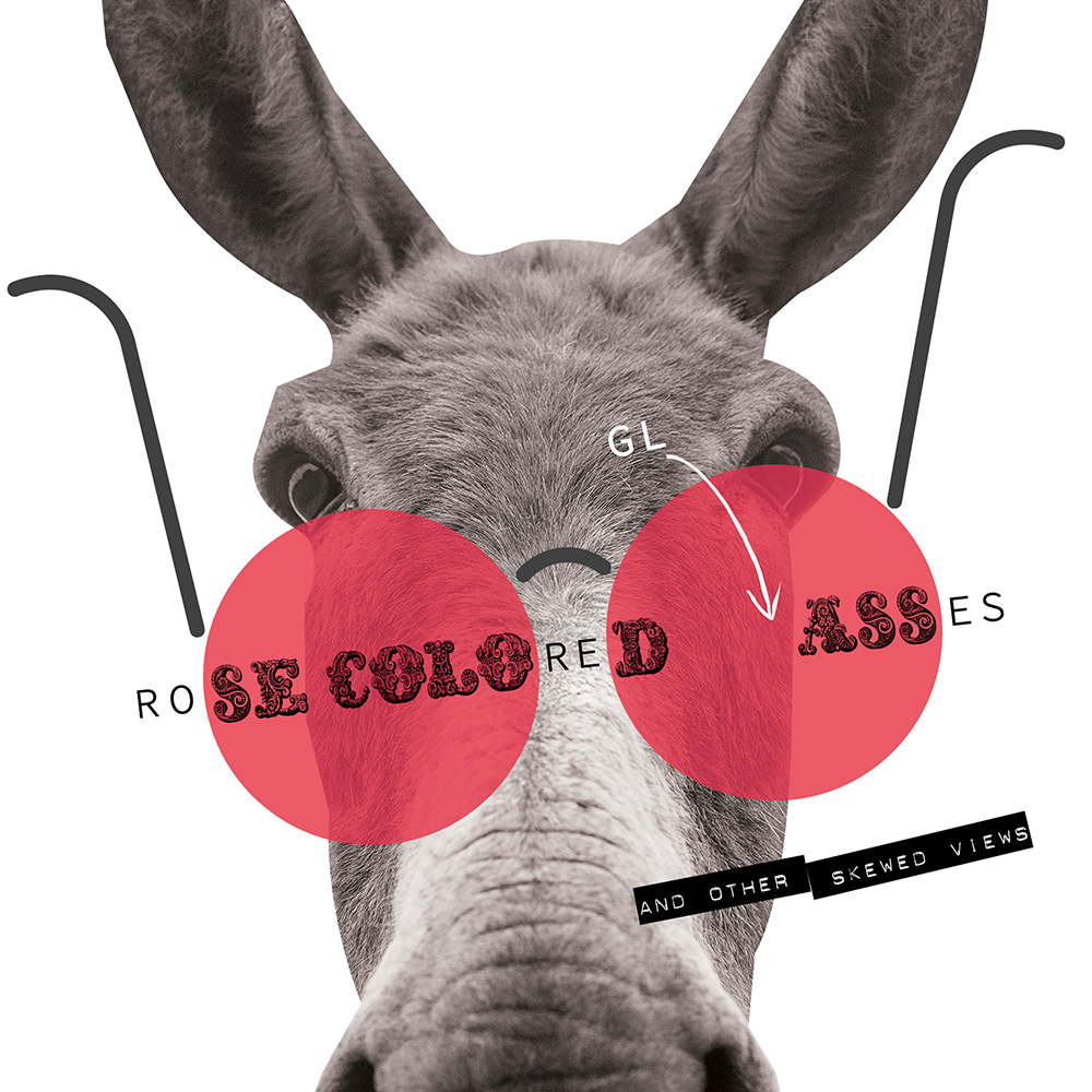
Rose-Colored (gl)Asses And Other Skewed Views
One of the tenets of this book is to have fun. To be free of the inevitable frustrations that can arise when working with clients that see you as a scribe rather than an author. With this in mind I am able to look at things in any manner I see fit. It can be my own, unique, “perfect” view of the world. That view can be conceptual, stylistic, unexpected, conventional, dignified, or low-brow. And oh yes, it should be fun. My hope is that its collection will be half as entertaining to viewers as it was to its creator.

Bugaboo Spray Killing the Creative Blues
The need for a creative outlet was one of the driving forces behind the inception of this book. Here the creative blues are personified as a pesky, nondescript bugaboo whose days are numbered. In typical Jackie Chan fashion, the violence is filtered through the lens of humor. This creates multiple meanings for the word ‘spray’ to tie in with ‘killing’. And, honestly, the word ‘bugaboo’ is just fun.
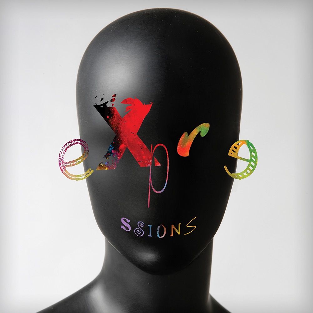
Expressions
Expressions as phrases. Expressions as visual interpretation. Expressions as facial gestures. OK, maybe that last one is just having a bit of fun rather than strictly adhering to the meaning of the book, but it forms a triple visual entendre all the same. The book is about design methods to express words—and having fun while doing it. So, maybe the playful face is relevant after all.

Sayings
Unabashedly hokey and corny, this cover title unapologetically says “ings.” Not once, but over and over. And in various formats and styles. Gee whiz, do you get it?
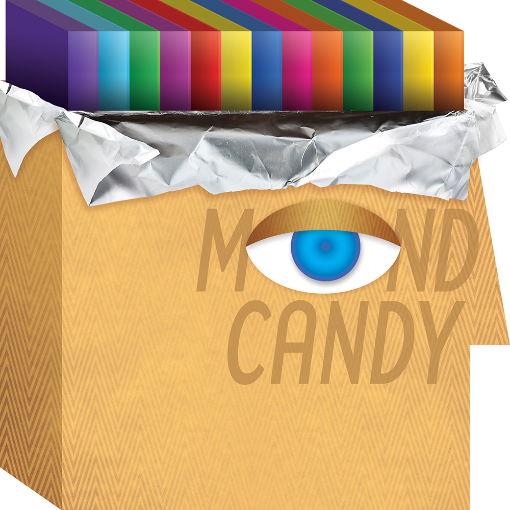
Mind Candy
This book—indeed graphic design—is about thinking visually. Portraying meaning with shape, color, type, organization, and imagery. One part visual, one part intellectual (with some emotion along the way). It is of the mind and of the sense of sight, each incomplete without the other. To that end the amalgumation of “M(eye)nd” is appropriate. And, just hopefully, interesting and delightful enough that it is pleasurable to view-—a M(eye)nd Candy of sorts. It is certainly an ongoing mental + visual joy to make.
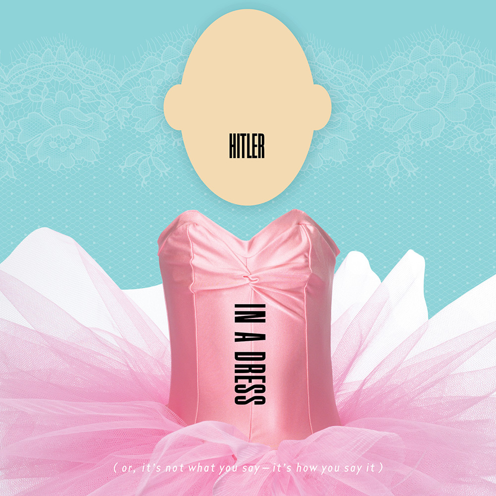
Hitler in a Dress Or, It’s Not What You Say, It’s How You Say It
Book titles can be proper, descriptive, authoritative, professorial, or they can be whacky and attention-grabbing. Hopefully you think of this as the latter and aren’t offended. The sub-title here is key. It provides insight into what this book is all about—the act of translating meaning. In our case, visual translation. What more powerful example of an orators way of saying things outshining what is actually said than Hitler. But he was a tool, so we turn that on its head and make fun of him. This cover will undoubtedly never make the cut, but was sure fun to design.
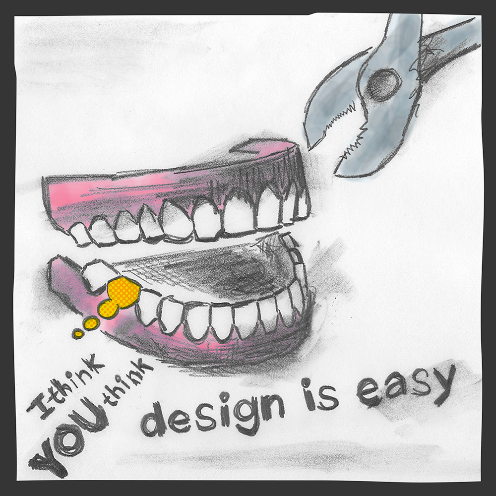
I Think YOU Think Design is Easy
Lo-fi, haphazard, sketchy, lomographic design (ala James Victore) is actually much harder to do than you would think. Something that looks quick and “in-the-moment” can often have an endearing quality that feels authentic and strangely contemporary. The irony of rendering a piece about design being easy in a seemingly easy style is a true example of marrying medium with message. Wrapping up a book about design exploration with this parting thought also creates an additional arc in the book’s story.
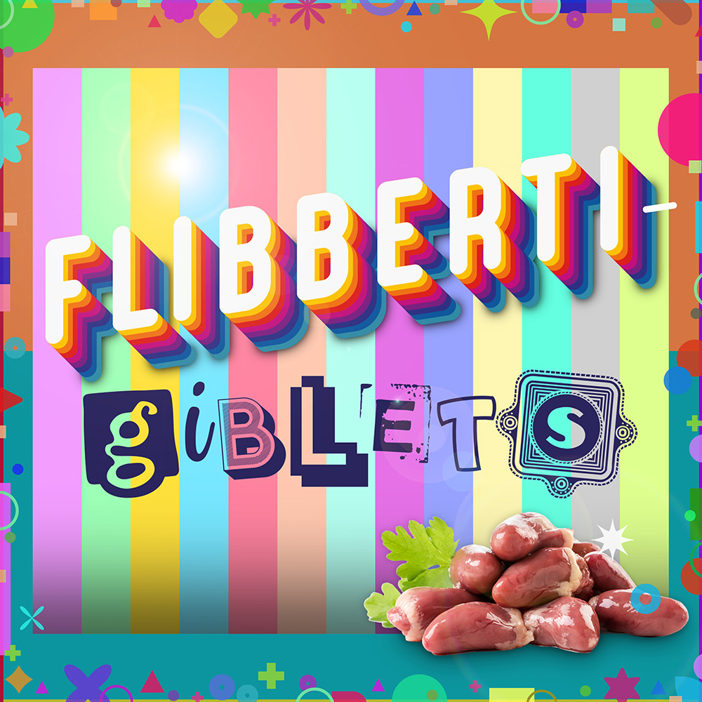
Flibbertigiblets
I love the old-fashioned term ‘flibbertigibbet’, which refers to a silly, whimsical, overly talkative and flighty person. One little switch from ‘gibbet’ to ‘giblet’ and you have a completely different thing. With giblets being pieces and parts that get cooked together to make an overall gravy, this felt like a merged-metaphor for the book: individual silly pieces put together for the overall flavor. It’s also kinda nuts to put disgusting giblets on top of an explosion of candy colors and analagous geometric pieces.
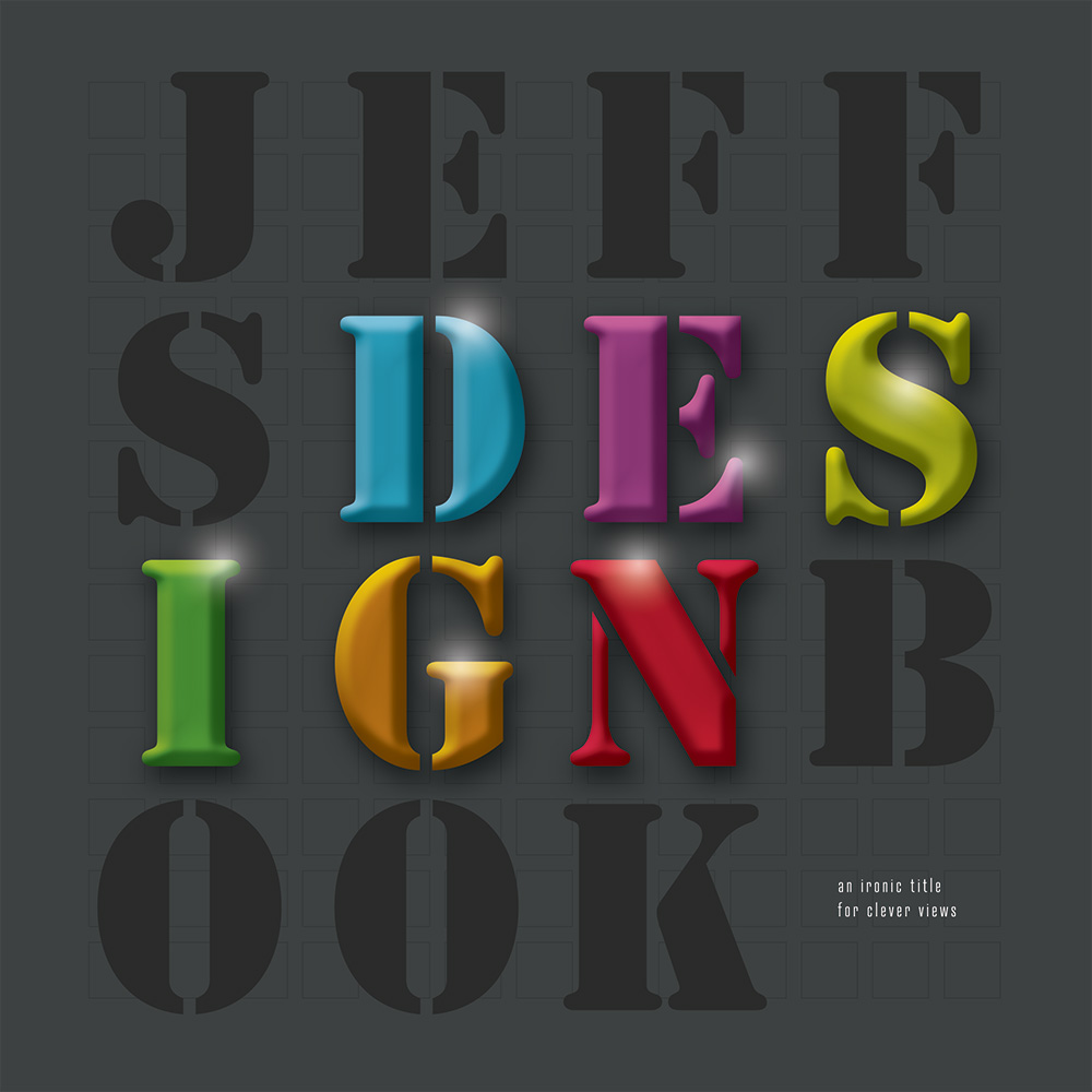
"Jeff's Design Book", An Ironic Title for Clever Views
OK, it’s a bit of a joke at this point. I keep searching for the “right” book title, and I keep coming up short. As a result I wind up referring to this as “Jeff’s Design Book”. The parent folder on my computer even uses that name since it continues to change. I suppose the irony can be an interesting direction (such a generic, un-smart, non-creative title for work trying to be clever and visually unique). Or maybe it gets hipster points for being so meta-literal. But maybe not now that I over-analyzed and talked about it. I lost my chance at laid-back apathetic-cool.
Thanks for playing along.
Come back and see me soon. I add to this book often.
