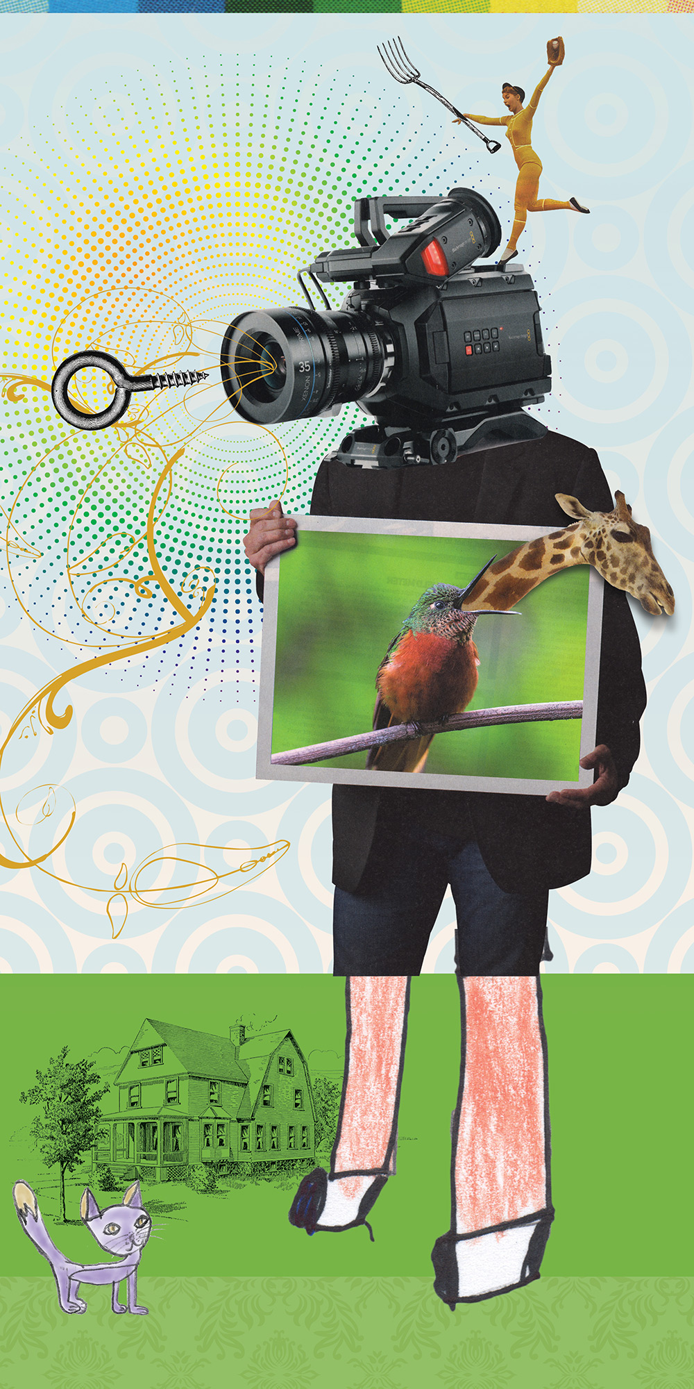
No phrase, idiom, or quotation being visualized here. Just the sheer joy of playing with collage. A melting-pot image recomposed of photography, patterns, color blocks, line art, and even drawings from our young daughter.
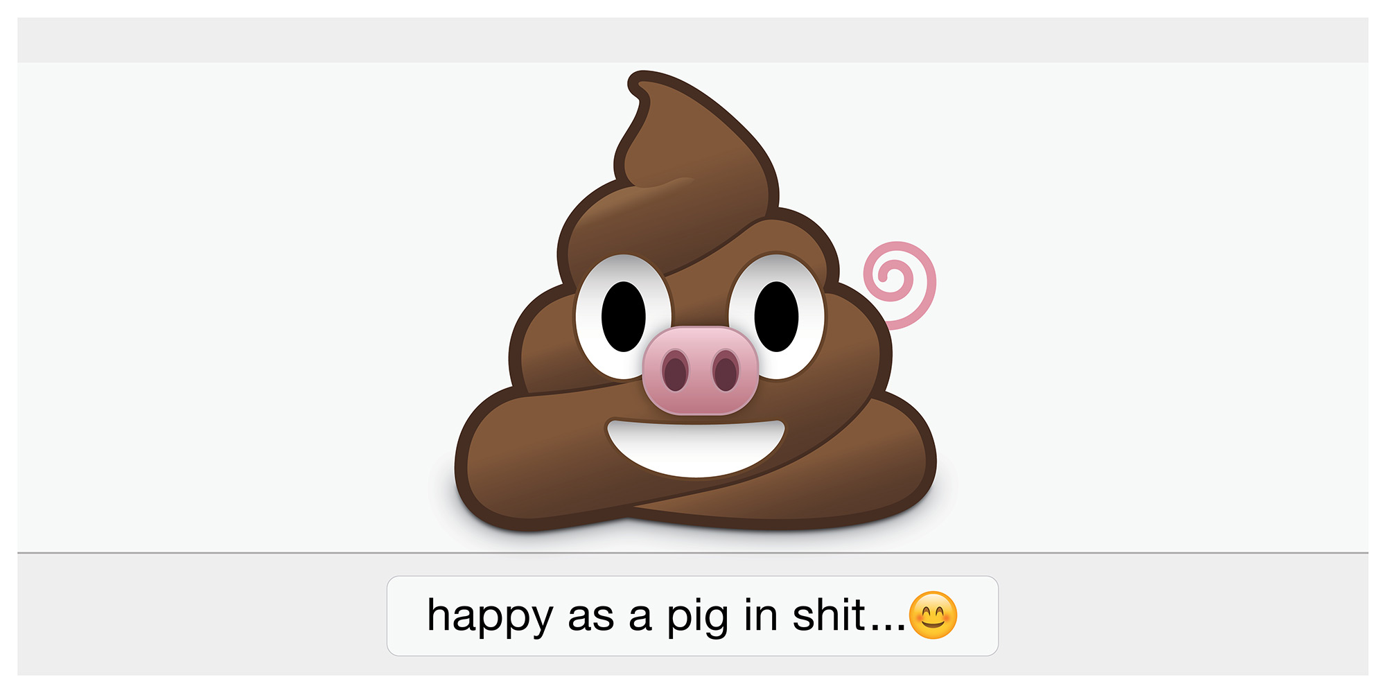
Happy as a Pig in Shit
Emoticons are certainly trendy, and I certainly avoid trends like the plague. However, when one of your rules is to purposefully explore things you normally don’t this becomes a challenge to accept. The trick is to riff on it, with a twist, in the hopes that it evolves into a clever message of its time rather than another “me too” plagiarization.
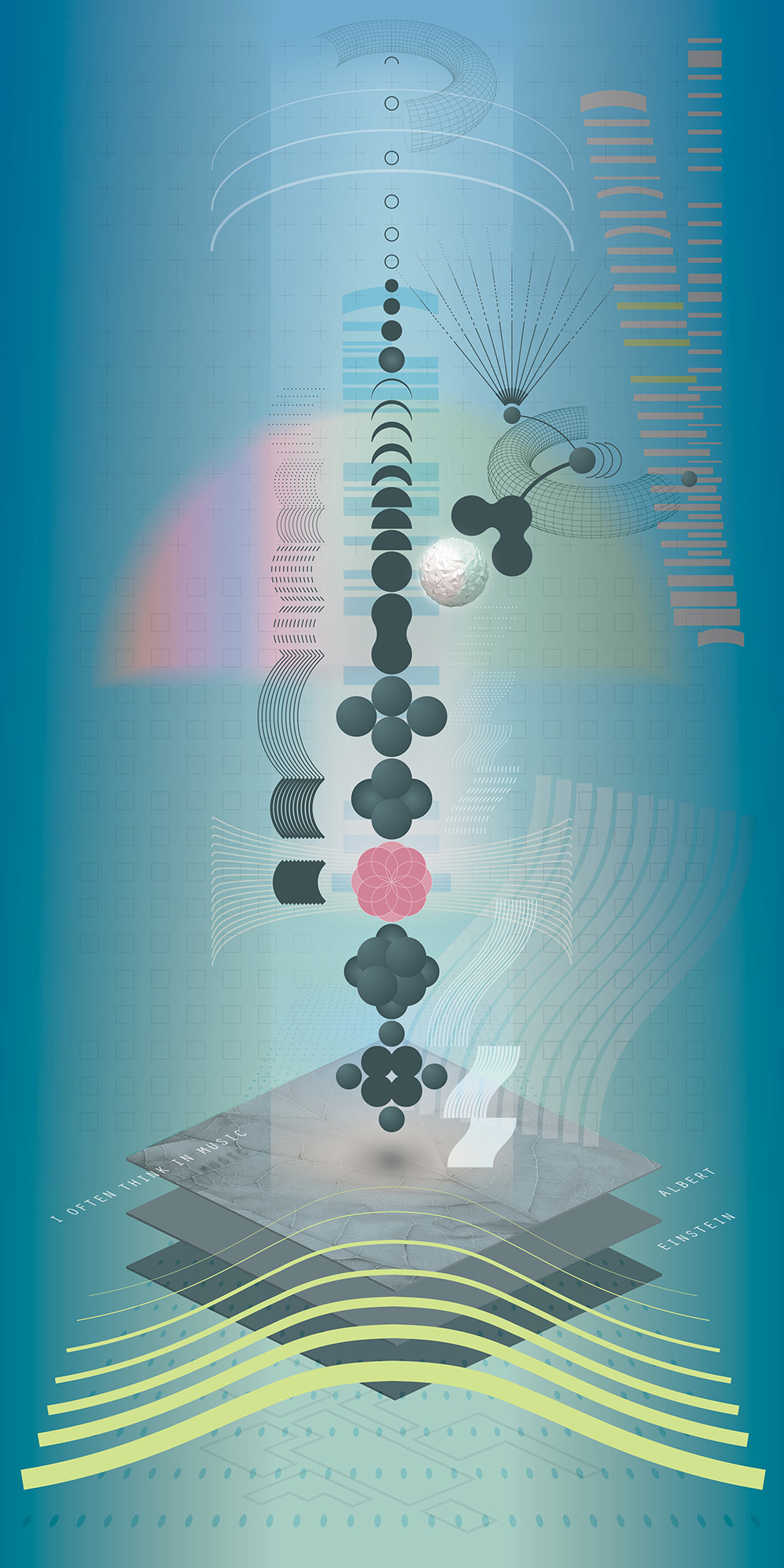
I Often Think in Music
This quote by Albert Einstein brings to mind an unseen complex dimension of harmony and physics. Planes, particles, strings, and arcs move through space in rhythmn and syncopation. I recently started to learn the guitar. I wouldn’t want to try and play this.
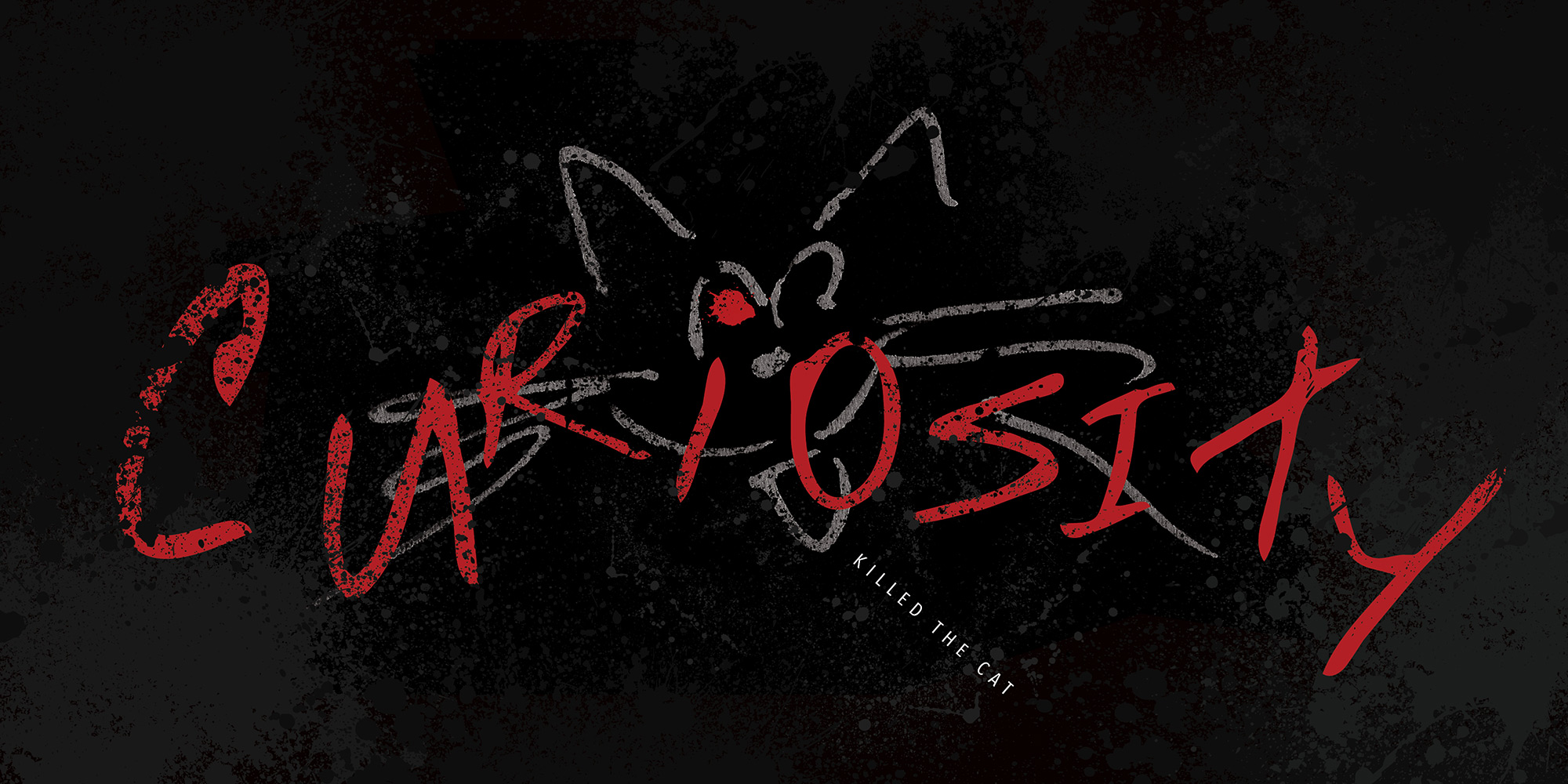
Curiosity Killed the Cat
I admit it: we have a cat that I am not friends with. I under-appreciate this cat’s obsessive inquisitiveness, especially when it involves my things being broken, spilled, or scattered. Maybe this is wishful thinking—or therapy—but a chewed-up cat that has been overtaken by its own deadly curiosity suits me just fine.
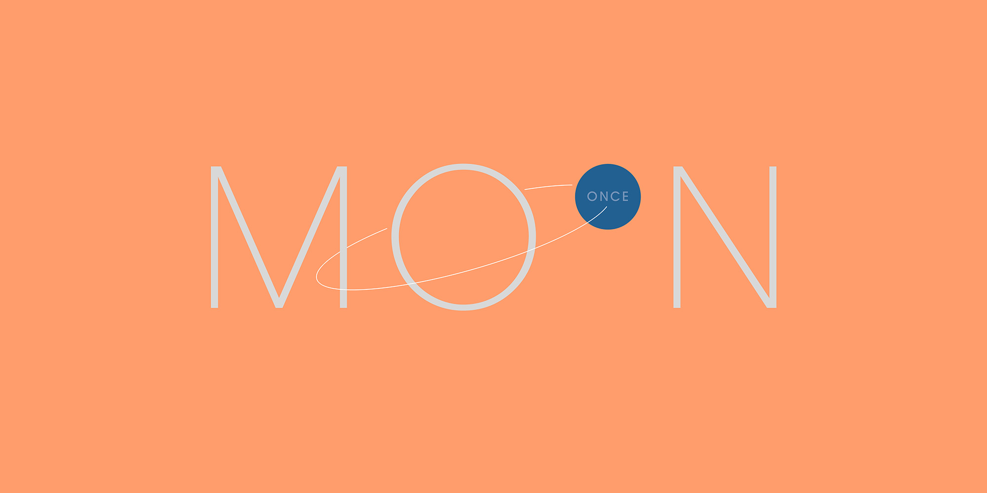
Once in a Blue Moon
A typographic puzzle that does the job of representing its proper, grammatically correct sentence. The orbit line tracing the path of the second “O” around the first simultaneously depicts the scene while maintaining the integrity of the word.
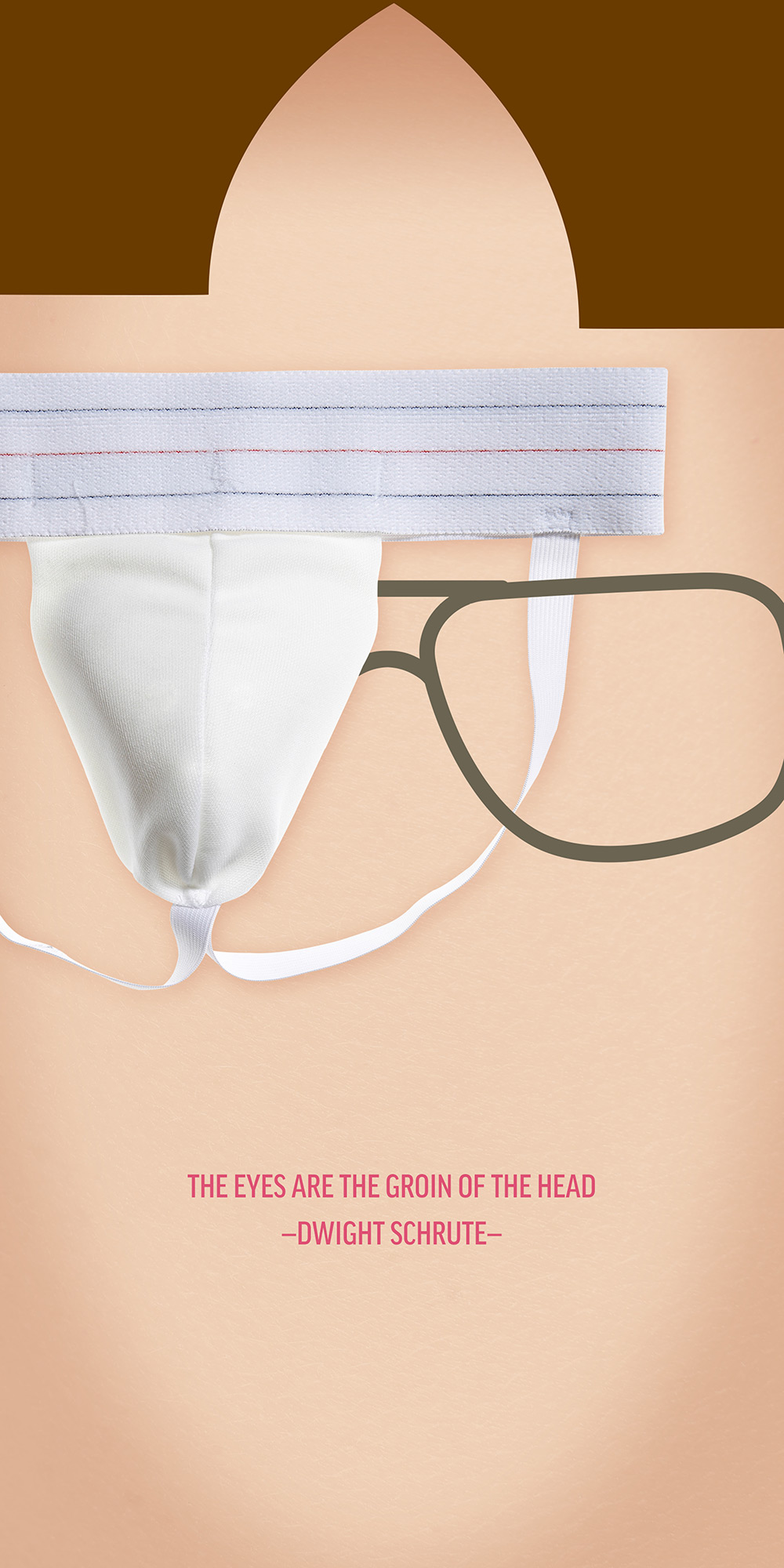
The Eyes Are the Groin of the Head
The best sitcom ever. And a ridiculous rendering for a ridiculously great quote from it.
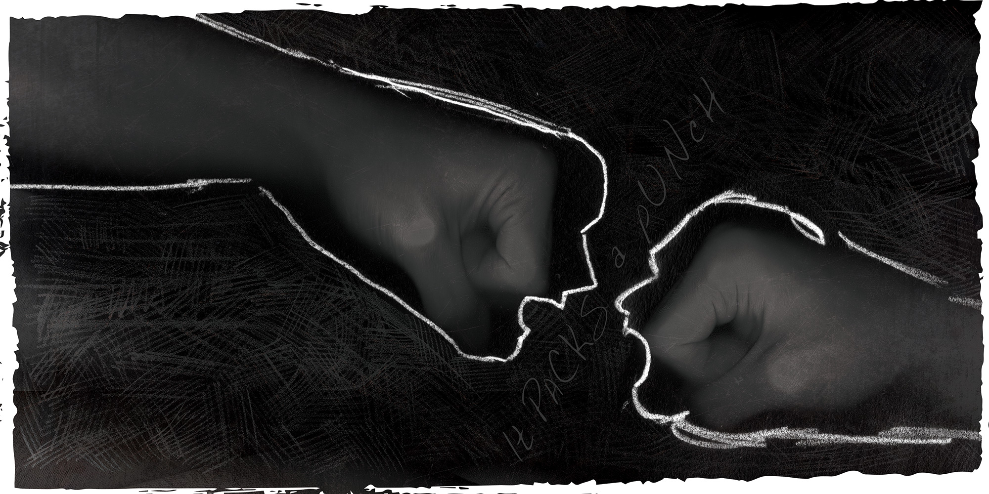
It Pack’s a Punch
Imperfect xerography combined with rough, sophomorish pencil lines help create a primitive mood to complete the personality of this aggressive scene. Typography nestles between the fists/faces to amplify the impending crash.
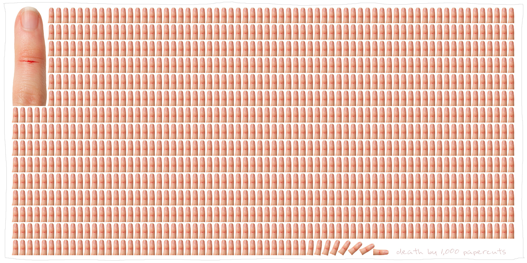
Death by 1,000 Papercuts
Can’t take it anymore? You’re just getting started. But just how much is too much? Sure we can say 1,000, but when we actually see it we can actually feel it. This takes a cue from information design and lets us understand what this amount means.
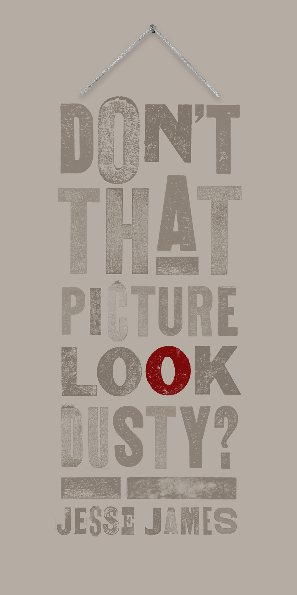
Jesse James
When Jesse James uttered these last, famous words–before turning his back to Robert Ford–who then assassinated him, he didn’t realize how the visualization of this quote basically made itself. Old West letterpress letters that also happen to look dusty came together to do double duty. Put them into the configuration of a picture frame, throw in the hint of a bloody bullet hole and it hints at 4 things at once. What is a double entendre times two?
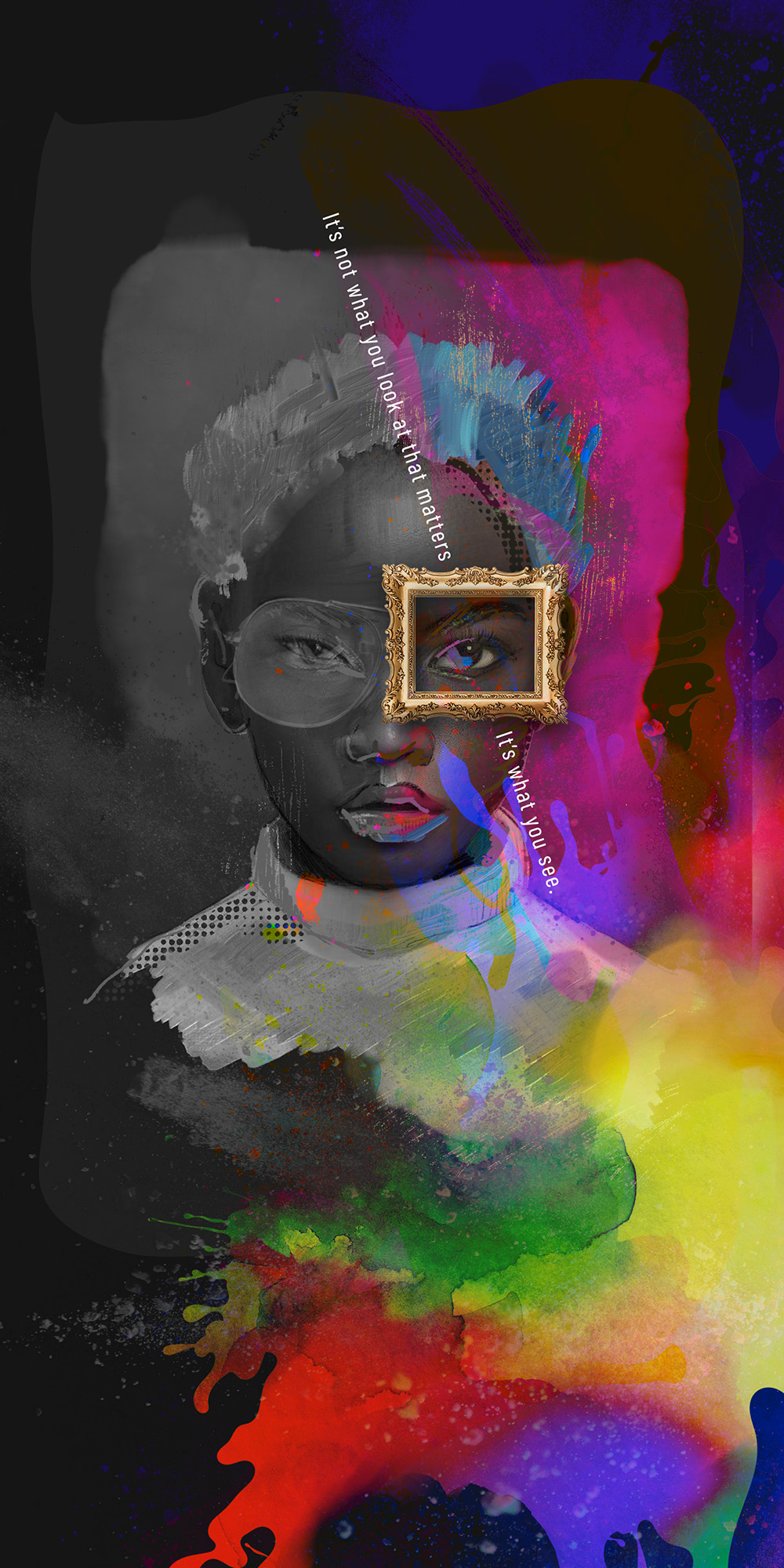
Henry David Thoreau
“It’s not what you look at that matters, it’s what you see” felt like a perfect quote to play with artistic and illustrative expression. Watercolor, oil paint, and pencil sketching as a foundation in Adobe Fresco that was then blended digitally with a touch of photography and collage. Monochromatic / color contrast works to support the punch of meaning as the eyeglasses transform.