The straightest path is rarely the most scenic.
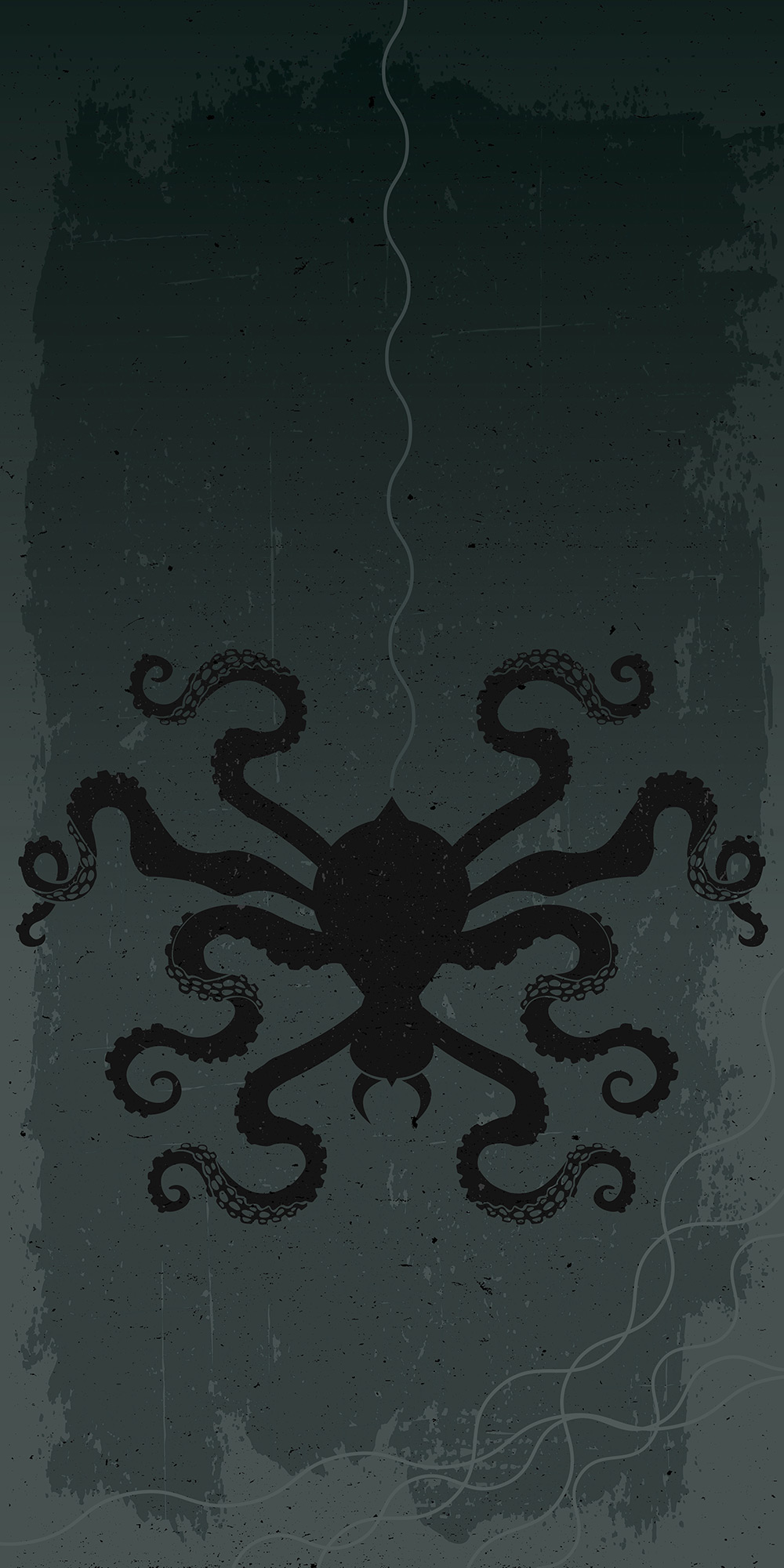
Octospiderpus
Plain and simply, or suddenly and enigmatically, some thoughts come out of the blue with no amount of process or methodology. Many books document this mysterious and almost magical occurrence. Perhaps I was killing a spider for my wife while the Discovery channel played a documentary about ocean creatures. Whatever the subconscious reason, I thought the combination of spider and octopus to be obvious and interesting enough to visualize. Indications of spider webs that have the rounded characteristics of ocean waves complete the notion.
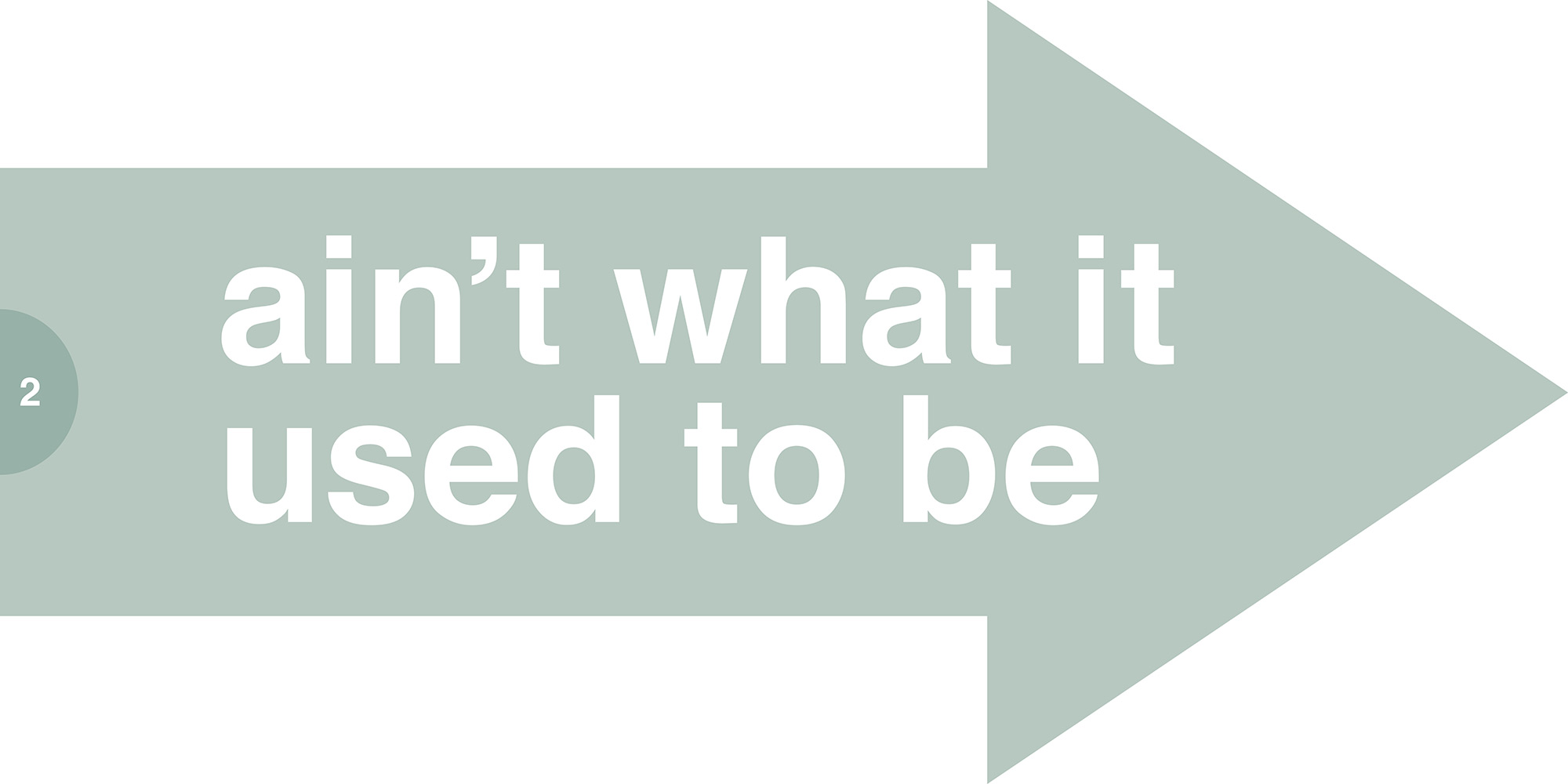

The Future Ain’t What it Used to Be
At the heart of graphic design is meaning and function. Hopefully this is in the form of some sort of uniquely intelligent solution–which smacks of being clever. Sometimes being clever is all the aesthetic you need. This is certainly not aesthetic at all, but its multi-paged misorder is trying to be clever. It challenges the viewer to put both pages together as a unit and connects the turning of the page with the result of the time it takes to do so.
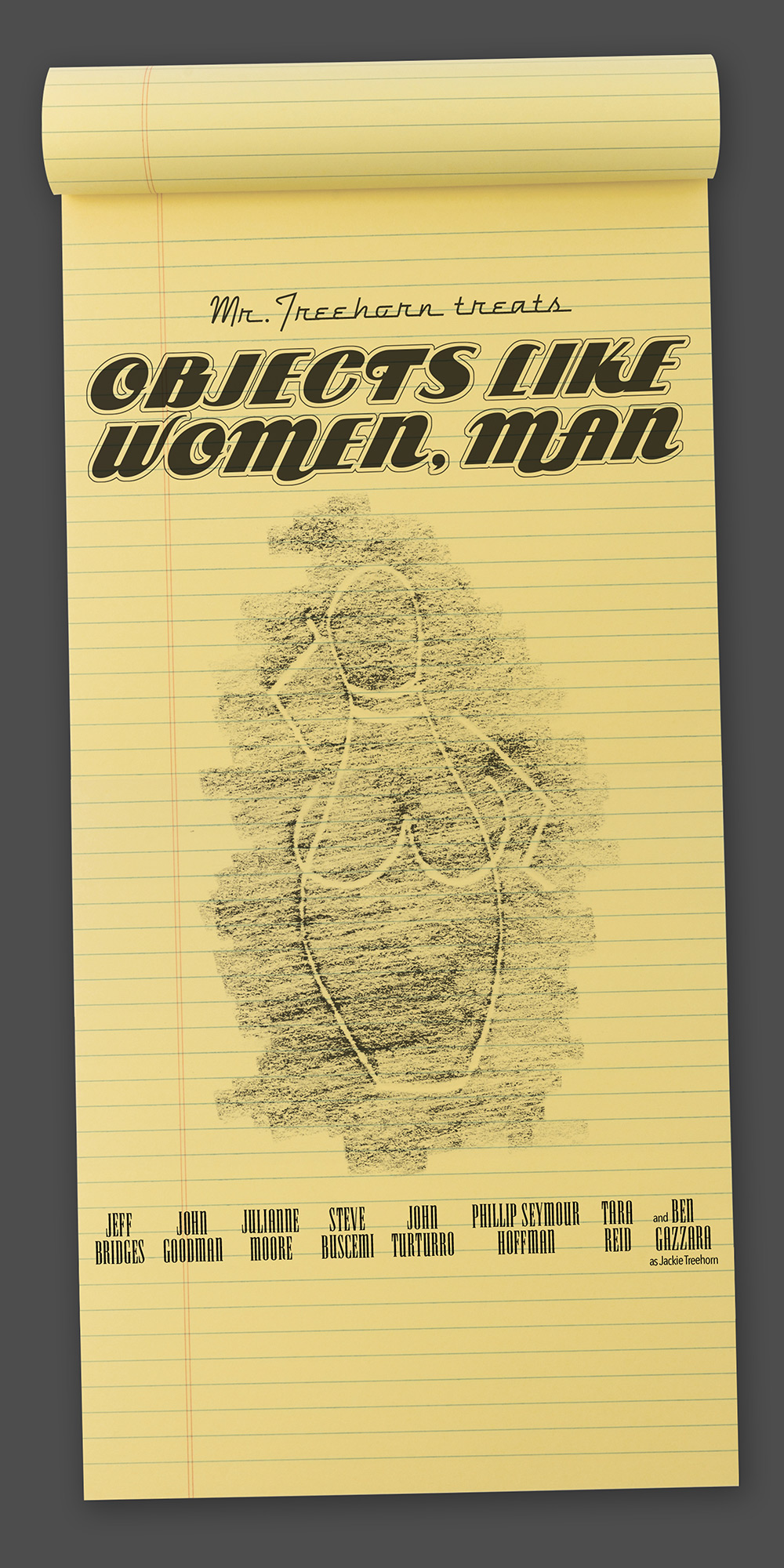
The Big Lebowski
In one of the most quoted movies of all time, The Dude lifts a pencil doodle from Jackie Treehorn by way of frottage. As luck would have it this lended itself to looking stylistically different than anything else in the book. Blend the literal idea of that situation with some conceptual imagery and movie-poster-format conventions and it’s visualized, man. I usually avoid literal situations, but in this case it felt important that the pencil sketch is made by a non-visual artist—which means that the aesthetics of the illustration aren’t great. Making it more literal emphasizes the situation rather than the illustration. Deep, man.
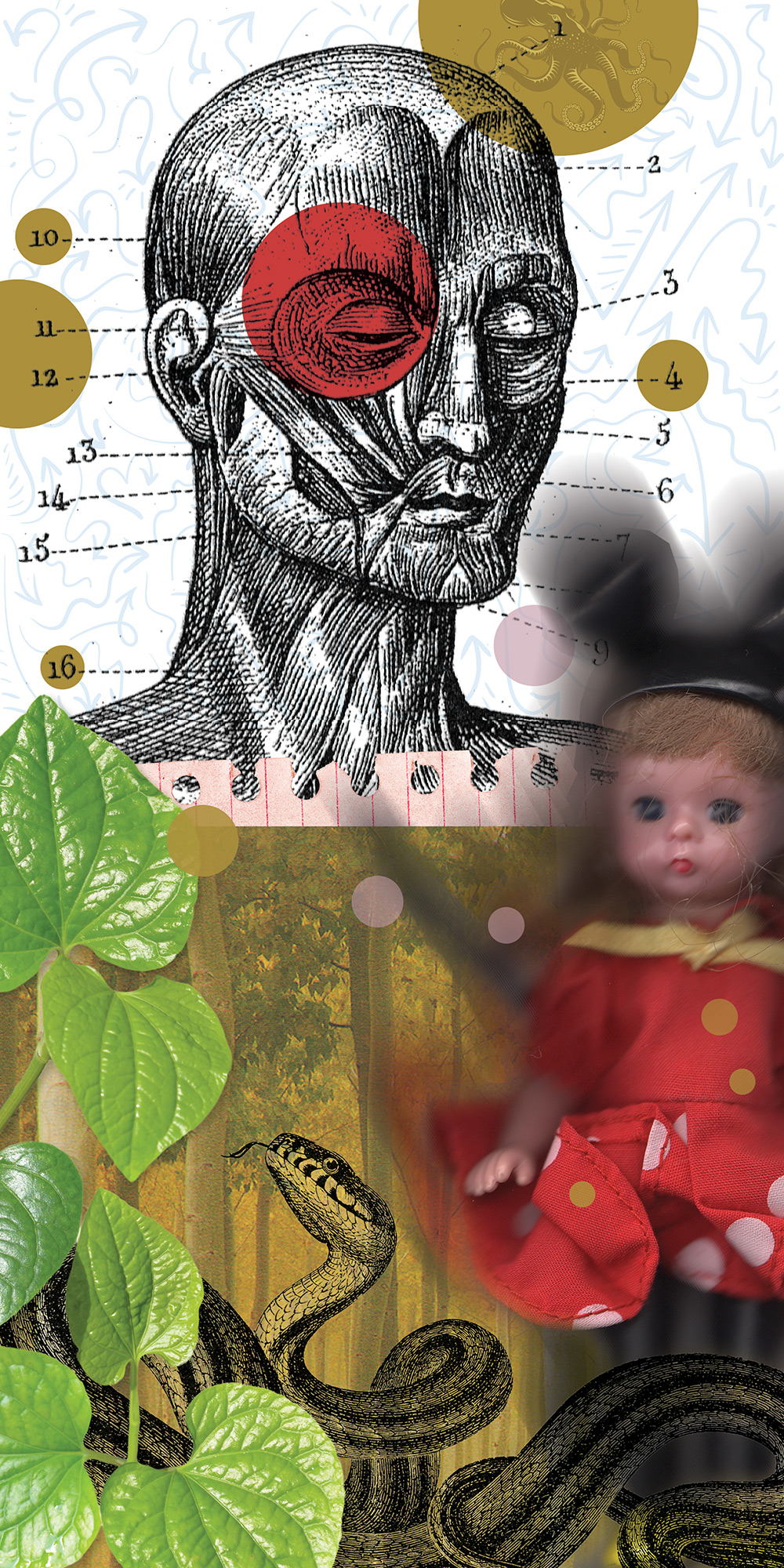
Art Collage 2
Apparently I really enjoy collage as this is the second entry of its kind. Again, this was in pursuit of illustrating no particular phrase. Perhaps some tweaking can create retro-meaning. But isn’t that process backwards? Doesn’t the need precede the response? Is this allowed in graphic design? Non-traditional and unorthodox for sure, one of the great joys of this book is freedom-of-process. And truth be told: other pieces in the book began backwards as well.
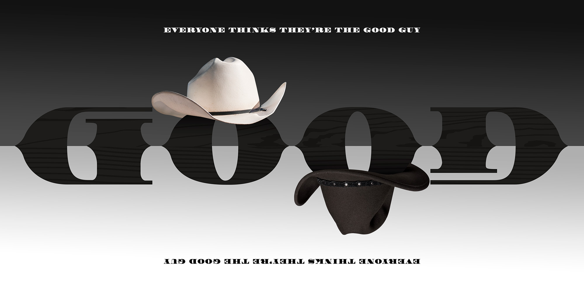
Everyone Thinks They’re the Good Guy
The powerful duality of this expression lends itself perfectly to the behavioral nature of an ambigram. Flipping this piece upside down quickly reveals that the main illustrative word still reads “GOOD”, only this time the supporting image is black instead of white, and against a white backdrop rather than black—thus questioning which is really right or wrong. The whole motif is flavored with a western persona in order to emphasize the use of the symbolic good and bad cowboy—the white and black hat.
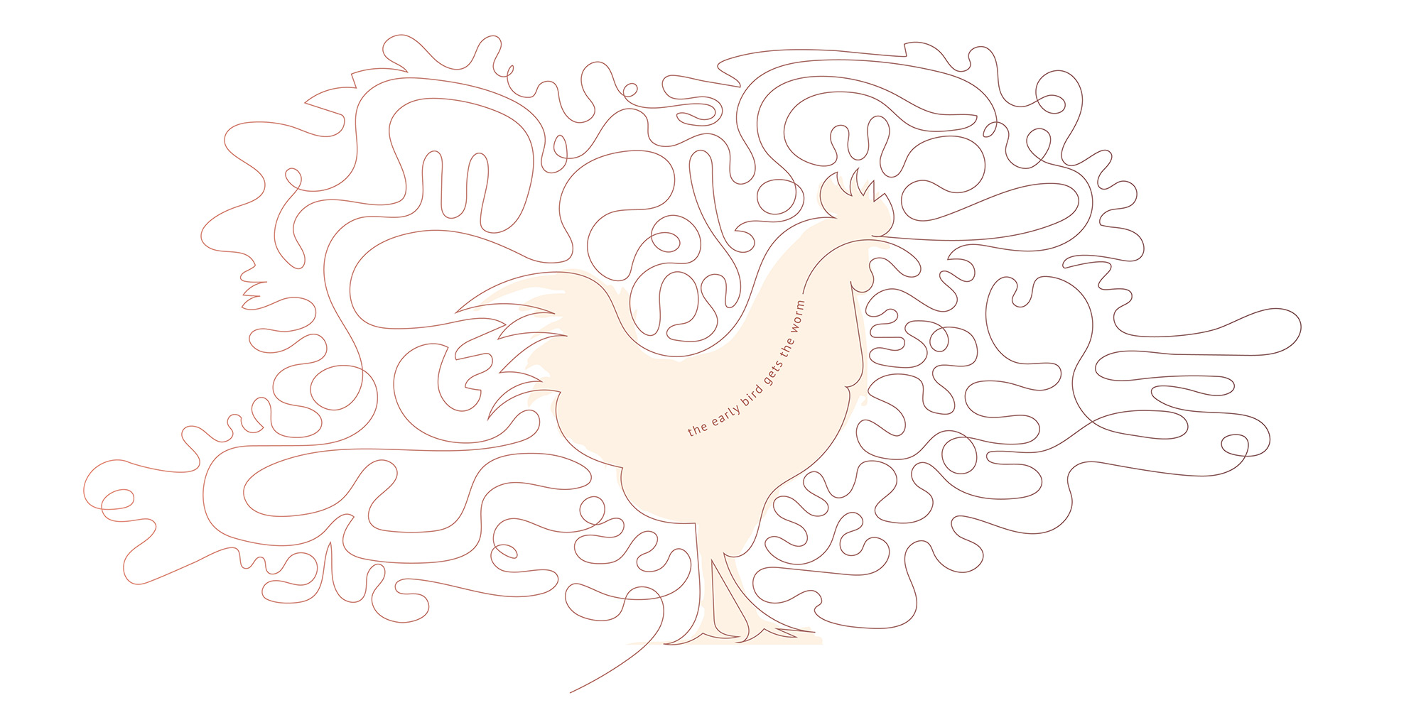
The Early Bird Gets the Worm
A worm is typically long and skinny. But who says a worm has to only be a familiar “worm-like” length of long and skinny? Playing that thought out results in a ridiculous length of worm–maybe a tapeworm. But then the problem becomes what to do with it. Why not turn that weakness into a strength, and uniqueness, and have the suggestion of worm also create the very bird eating it. Rather existential, or cannibalistic? but more unexpected and, hopefully, more interesting.
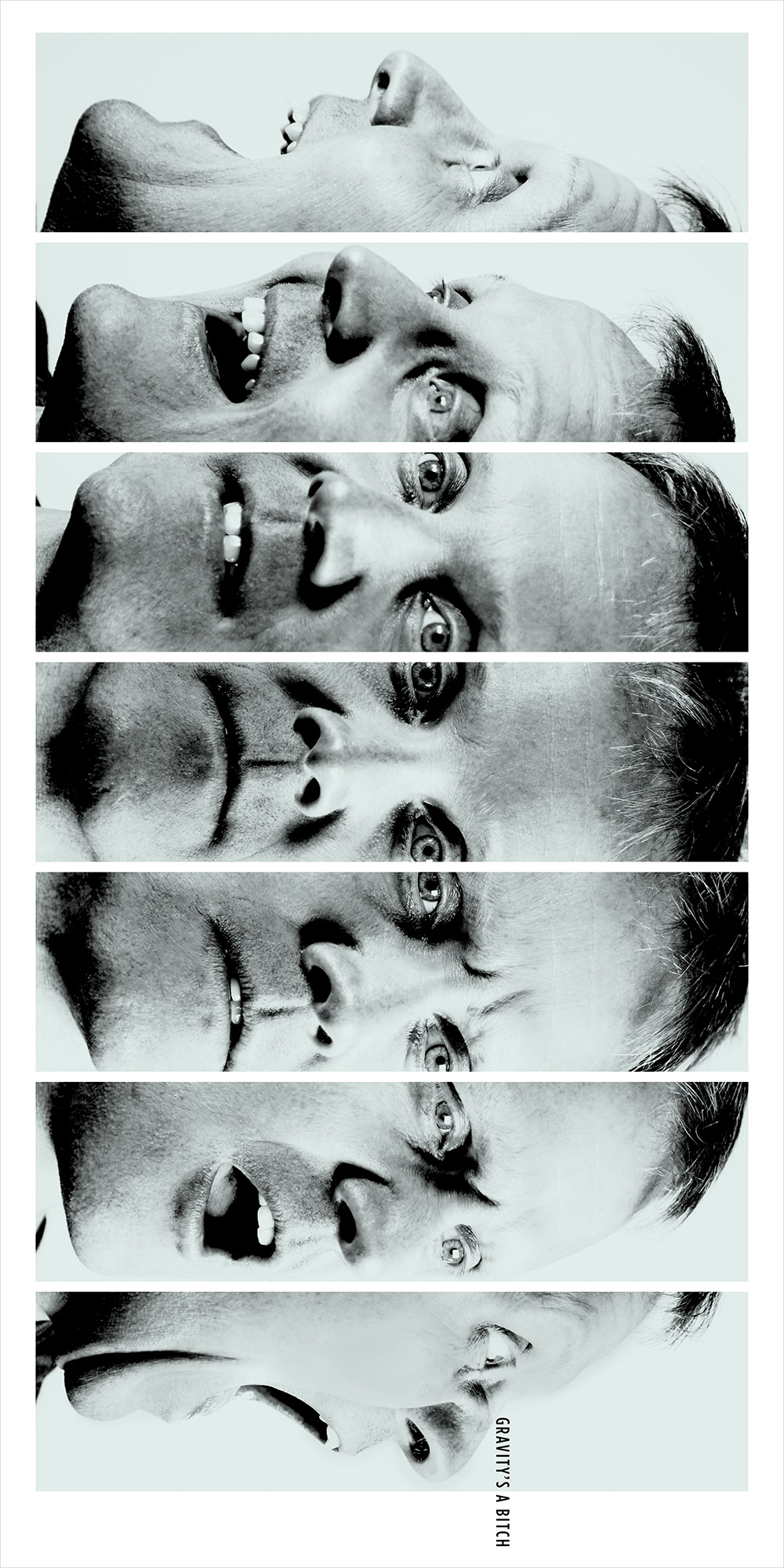
Gravity’s a Bitch
Sure, you could show an image having to do with height—a building, a cliff, an airplane–and then show the view. Or, have the letters of the phrase tumble down the page. But that felt expected. Things inherently having nothing to do with gravity felt like a more interesting challenge. Using sequence to show the expression on a face (d)evolve as it turns to look down the page suggests the results of falling in a less straightforward, and hopefully more cleverly memorable, way. A grittier photographic style complements the dire situation.
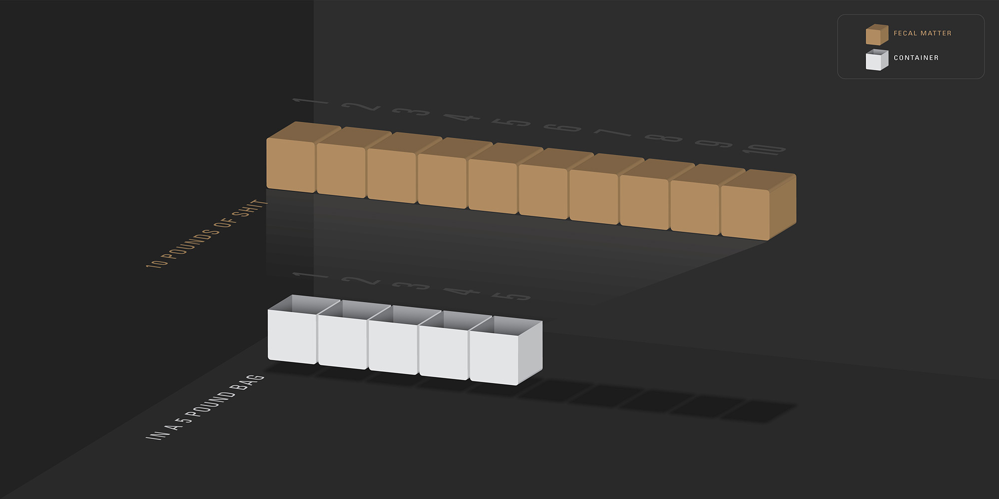
10 Pounds of Shit in a 5 Pound Bag
Information design is usually very serious. This saying is not. This saying does, however, lend itself well to being visualized in the manner of information design. Part of its charm lies in the irony of rendering such slang content in such a corporate way.
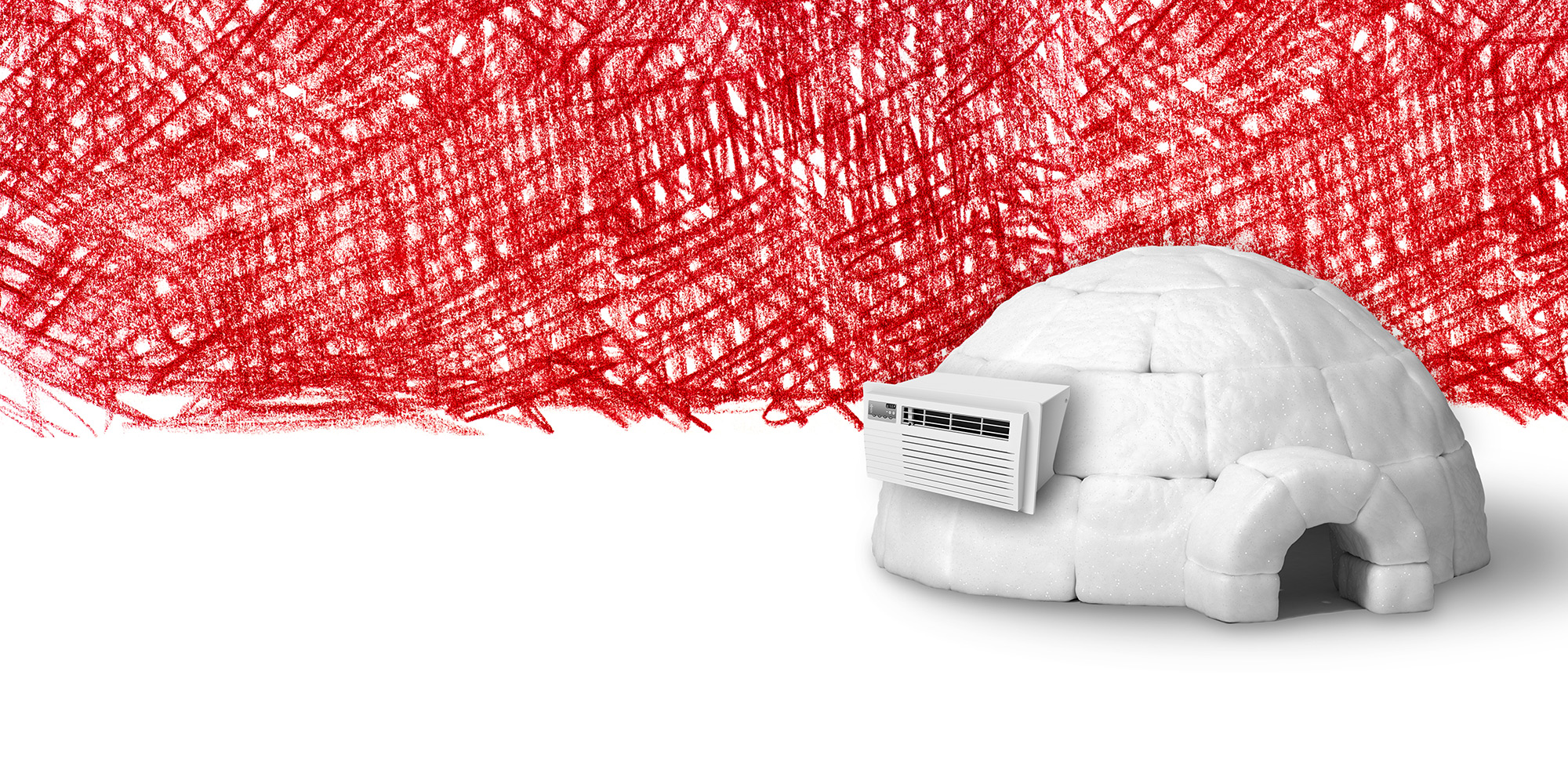
Air-Conditioned Igloo
I’m not a climate change denier. Eskimos have had 50 words for snow. Probably not as much need for all of them these days.
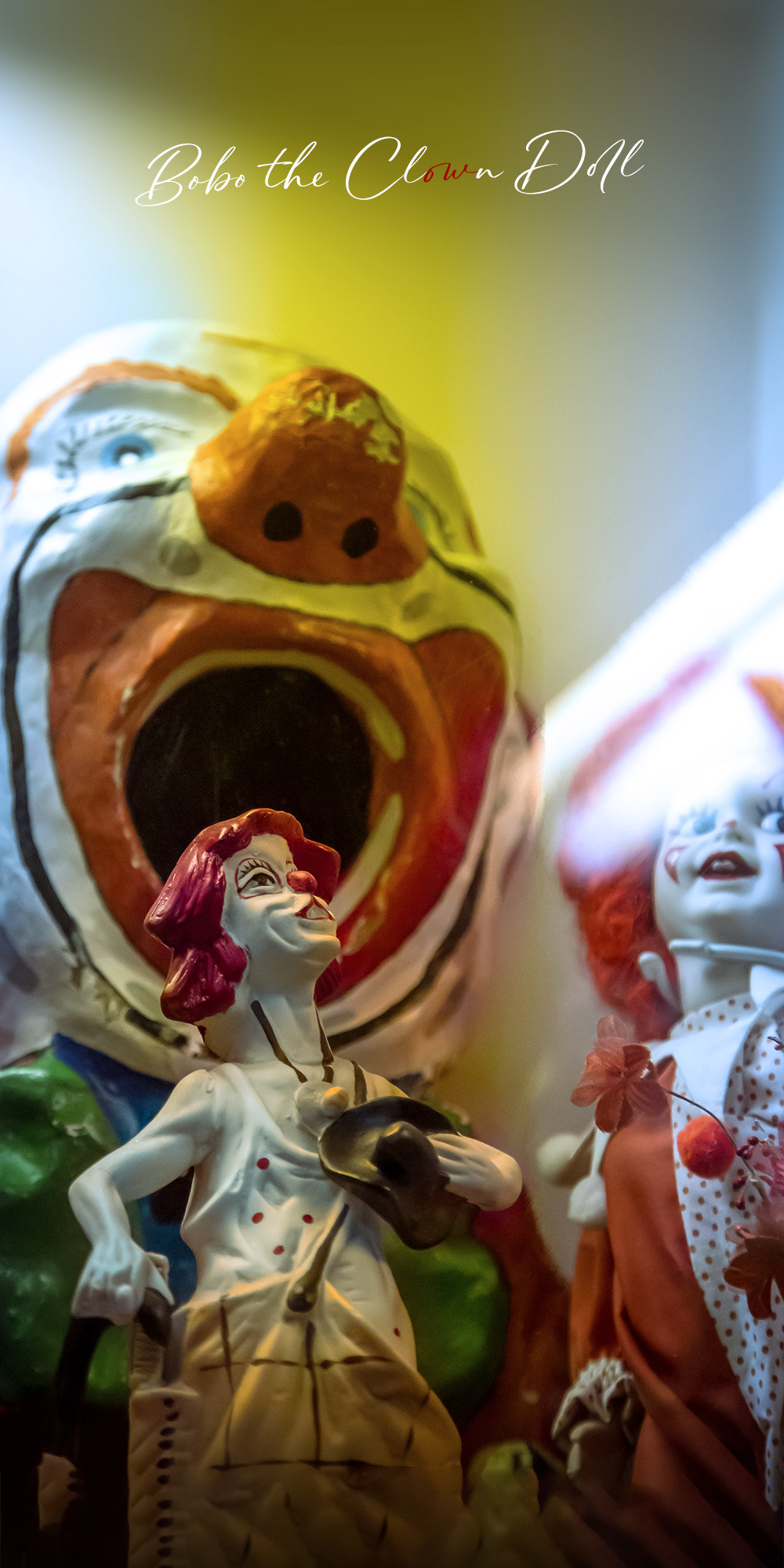
Bobo the Clown
In 1961, Stanford psychology professor, Albert Bandura conducted an experiment where small children observed adults punching, kicking, and assaulting a blow-up doll named Bobo. The experiment proved that children learned aggressive behavior from this exposure. I had taken this sinister-feeling photograph at a toy museum some time earlier and felt it captured this dark mood. Though careful angular juxtaposition was used to frame the image, it was a photo found purely by wandering around with a camera—not constructed, or designed in service to a concept. Serendipitous? Also, this could be an album cover. I’m looking at you Marilyn Manson.
