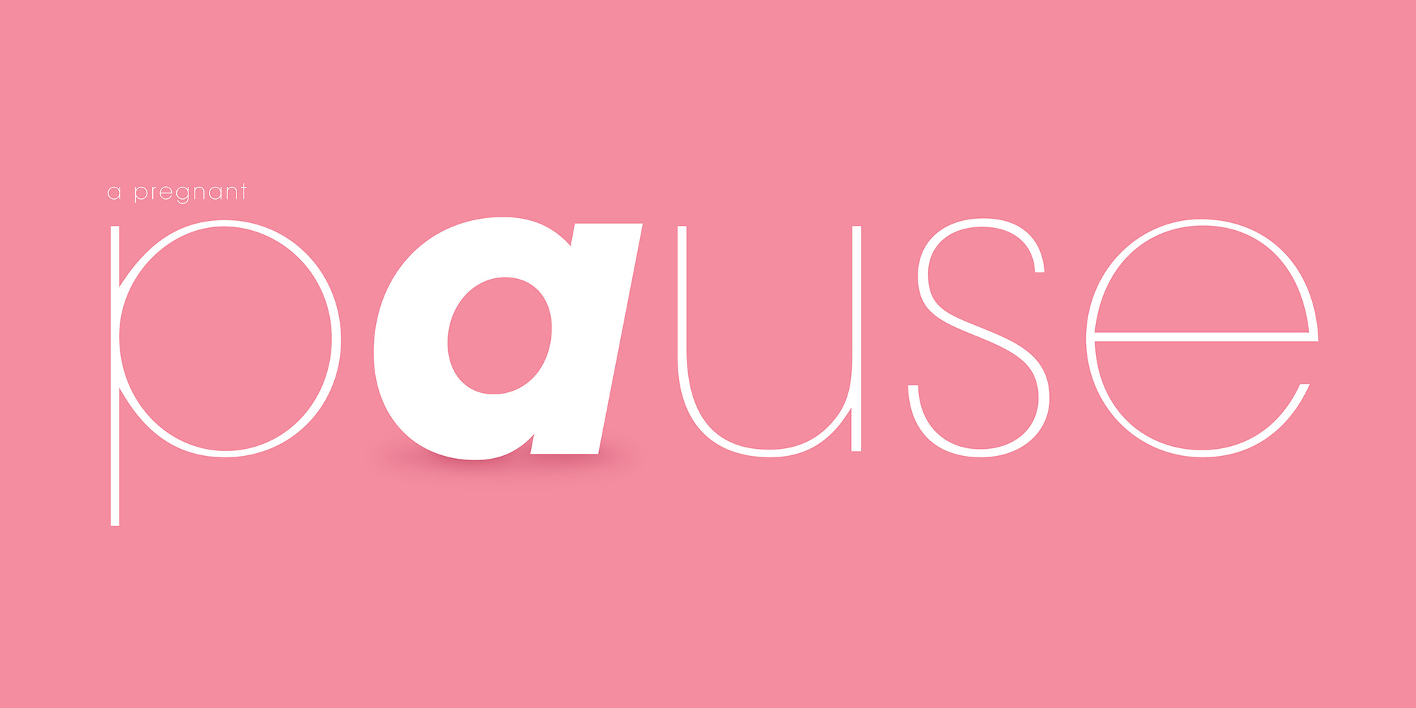
A simple contrast of letters can often do more to illustrate a point than trying to beat someone over the head with literal representation. Viewers will themselves feel clever that they are in on the clever joke as well—which creates a greater memory. Don’t forget the supplemental “body language”: softer, more delicate typographic style and symbolically understood color.